
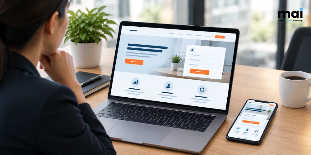
Most landing pages don’t fail because of anything dramatic. The headline says one thing and the ad said another. The form asks for six fields. The page loads slowly on a phone, so the visitor is gone before the offer shows up.
This landing page checklist walks through ten things worth checking on a page built to collect enquiries. It’s meant for lead generation pages, where a conversion is a call, a form submission or a WhatsApp message rather than a purchase.
What makes a lead generation landing page different from a homepage?
A homepage has to serve lots of visitors with different goals. A lead generation landing page has a narrower job: it targets a specific audience, focuses on one service or offer, and asks visitors to take one main action. It usually has no full menu, covers a single service, and sends every click toward the same action.
What should a landing page checklist for lead generation include?
A landing page checklist for lead generation should cover ten areas: one goal, a headline that matches the ad, a clear offer, tap-to-call and WhatsApp buttons, a short form, fast mobile loading, trust signals, a thank-you page, working conversion tracking, and a follow-up plan. If one area is missing, it can create another point where potential enquiries are lost.
Here’s each one, with a quick way to test it.
The 10 things every lead generation landing page needs
1. One goal, with a clear path to conversion
The goal is an enquiry. A call, a form or a WhatsApp message all count. Blog links, social icons and extra menu items don’t, and each one can take visitors away from the main conversion path. Cut anything that doesn’t help someone get in touch.
2. A headline that matches the ad
If someone clicks an ad for same-day AC repair, the first thing they should read is “same-day AC repair.” A line like “Welcome to our company” makes them wonder if they’ve landed on the wrong page, and some will leave right there. Use the ad’s own wording, offer and city.
Sending every click to the homepage is a common mistake. An ad for emergency plumbing should land on a page about emergency plumbing.
3. A clear offer above the fold
“Above the fold” just means whatever shows before the visitor scrolls. The first screen should make three things clear: what you do, who it’s for, and what happens next. “Free site visit within 24 hours” says more than “quality service at the best price.”
Don’t promise anything your team can’t deliver, though. A missed promise does more damage than a plain headline.
4. Tap-to-call and WhatsApp buttons
Typing on a phone is a chore, and tapping isn’t. Put a call button and a WhatsApp link on the first screen, and consider keeping them visible as the visitor scrolls on mobile. Check that the number actually gets answered during the hours your page claims.
5. A short form
Ask for the information your team needs to follow up, and nothing more. For most businesses, that’s a name, a phone number and a line about the job. If a field doesn’t change how you respond, delete it.
If your team calls leads back, keep the phone number. A lead you can’t reach is difficult to convert.
6. Fast loading on mobile
A slow page loses people before they’ve seen the offer. Google’s Core Web Vitals set clear targets.
| Metric | What it measures | Good | Poor |
|---|---|---|---|
| Largest Contentful Paint (LCP) | Loading: when the main content has likely loaded | 2.5 seconds or less | Over 4 seconds |
| Interaction to Next Paint (INP) | Responsiveness to taps and clicks | 200 ms or less | Over 500 ms |
| Cumulative Layout Shift (CLS) | Visual stability: unexpected movement | 0.1 or less | Over 0.25 |
web.dev also has a case study worth a look. Rakuten 24, a Japanese online store, split its traffic for a month, half to a faster landing page and half to the original. The two pages looked and worked the same, and only the speed work differed. The faster one loaded 0.4 seconds sooner in a mobile test, and its conversion rate rose 33.13%.
It’s a single store, and the study dates from 2022, so don’t expect the same jump on your page. The improvements came from fairly straightforward changes, including smaller images, less unused code and delaying images below the fold.
Run your page through PageSpeed Insights, then open it on a mid-range phone over mobile data. A fast office Wi-Fi connection can hide loading problems that visitors on slower connections may experience.
7. Trust signals and proof
Nobody wants to hand a phone number to a company they’ve never heard of. Show your Google review rating and review count, a real business address, and any licences or certifications you hold.
Real numbers, like years in business or jobs completed, work better than “trusted by many.” Only claim what you can prove, and ask before you use a client’s name or logo.
8. A thank-you page that says what happens next
Send people to a separate thank-you page after they submit the form. Tell them what to expect, for example: “We’ll call you within two hours, between 9 and 6.” The page also gives you a clean place to record a form conversion, because it can be shown after a successful form submission.
9. Conversion tracking for calls, forms and WhatsApp taps
If you can’t count enquiries, you can’t tell which ads bring them in. Google Ads Help says you can measure website conversions, like form submissions, and phone call conversions. Calls from ads, calls to a number on your site and clicks on a phone number on your mobile site can all be tracked. Track WhatsApp clicks as a separate conversion action, but remember that a click doesn’t necessarily mean a conversation took place.
Tracking also feeds the bidding. If your paid ads campaigns use Smart Bidding, such as target CPA or target ROAS, Google says those strategies optimize using conversion data. It also warns that misconfigured conversion actions can stop Smart Bidding from working well.
Mark your key actions as primary and check the tags with Google Tag Assistant. Then fill in your own form and call your own number before any money goes out.
10. A follow-up plan
Even a great page loses the lead if nobody replies. Decide who answers, how quickly, and on which channel before the ads start.
Missed calls need a callback routine. Form leads should go somewhere someone checks promptly, whether that’s a phone, CRM, shared inbox or lead management system. Track how many enquiries turn into paying customers, too, so you judge the page by results and not just clicks.
How do you know if a landing page change is working?
For a simple before-and-after comparison, change one major thing at a time, then compare enquiry rate before and after on the same traffic source. Enquiry rate is enquiries divided by visitors. If you change the headline and the form together, you can’t tell which change made the difference. Wait until enough visitors have seen the change, because a few leads can mislead.
An A/B test is a better option when you have enough traffic: compare two versions of the page over the same period, such as the original and a version with a different headline. With low traffic, compare one month to the next instead, and keep seasonal swings in mind, such as festival demand. Write down the date of every change.
Which fixes should come first?
Start with tracking, then check the headline match and form. If the page is clearly slow, move speed work to the top of the list after making sure tracking is working. Tracking comes first because you can’t measure the impact of other changes without it. Headline and form edits cost almost nothing, while speed work may need a developer.
That order is a judgment call, not a rule, so reshuffle it if your page needs it.
Run this landing page checklist before you raise your ad budget
More budget on a leaky page just means more leaks. Go through the ten points, fix the biggest gaps first, and change one thing at a time so you can see what worked. Raise the budget once the page turns clicks into enquiries at a rate you’re happy with.